Keyboard Shortcuts
Keyboard shortcuts allow users to execute actions, using a keyboard, that are usually performed with a mouse or trackpad. They increase the efficiency and productivity of users who primarily rely on their keyboard when interacting with applications.
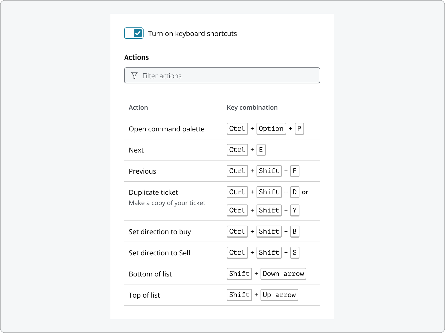
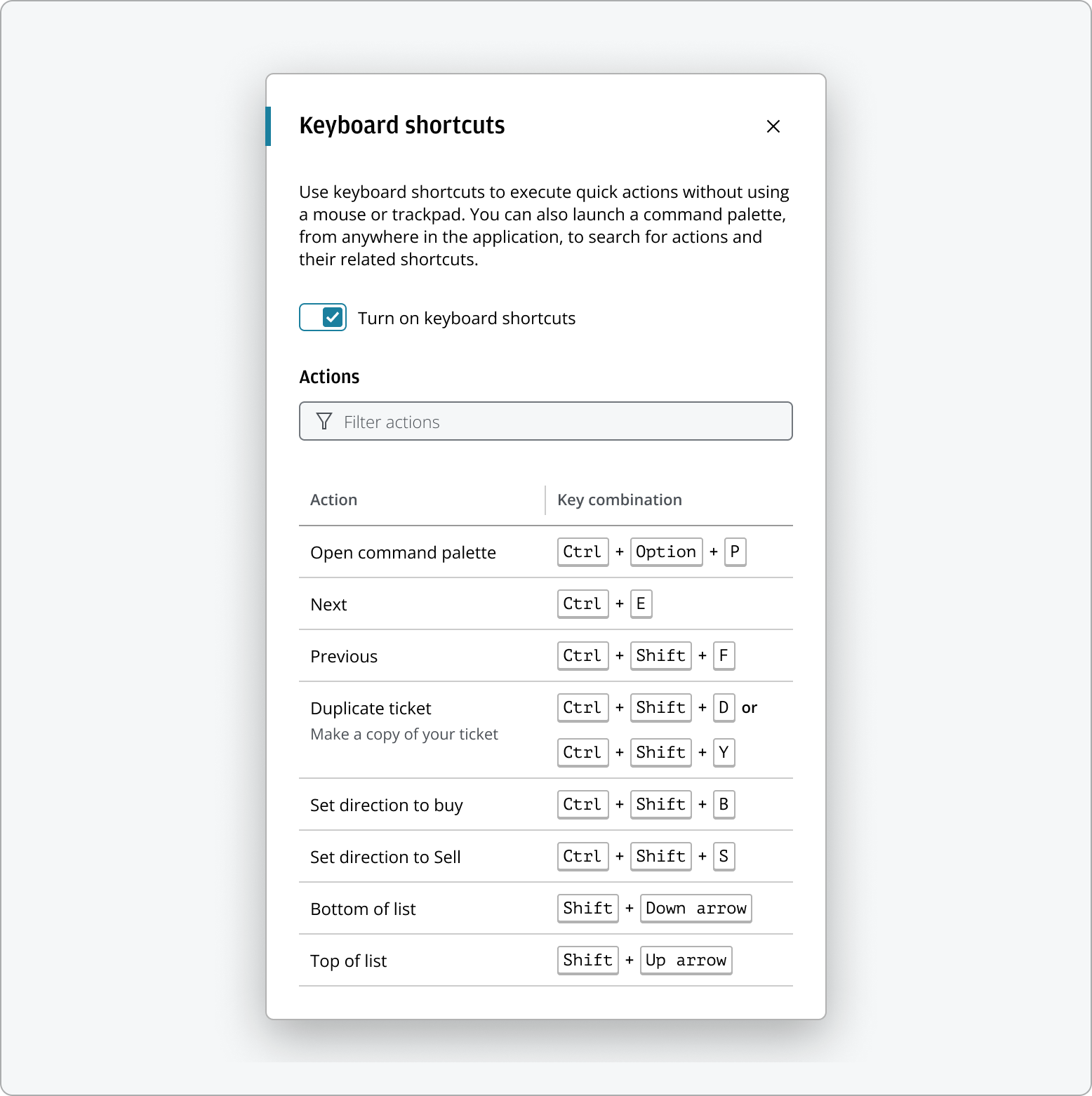
The keyboard shortcuts displays a comprehensive, searchable list of available shortcuts, helping users quickly learn and reference key combinations to navigate and perform actions efficiently.
Use this pattern to:
- Increase task efficiency by enabling users to perform actions quickly.
- Provide a true alternative to mouse or trackpad navigation, supporting users who prefer or require keyboard input.
- Clearly communicate available shortcuts to help users discover and learn efficient workflows.
- Allow users to search for and execute actions directly from the keyboard, improving accessibility and user experience.
Provide keyboard shortcuts to cater for users with accessibility needs who may not have access to a mouse.
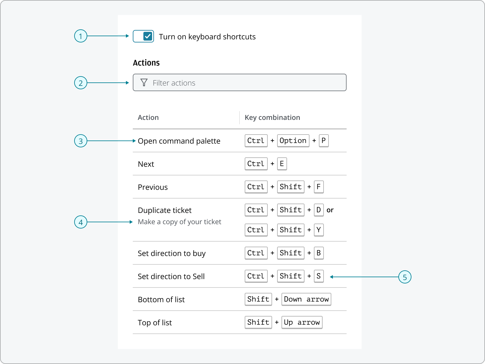
- Keyboard shortcuts switch: A switch that allows users to turn the keyboard shortcuts list on or off.
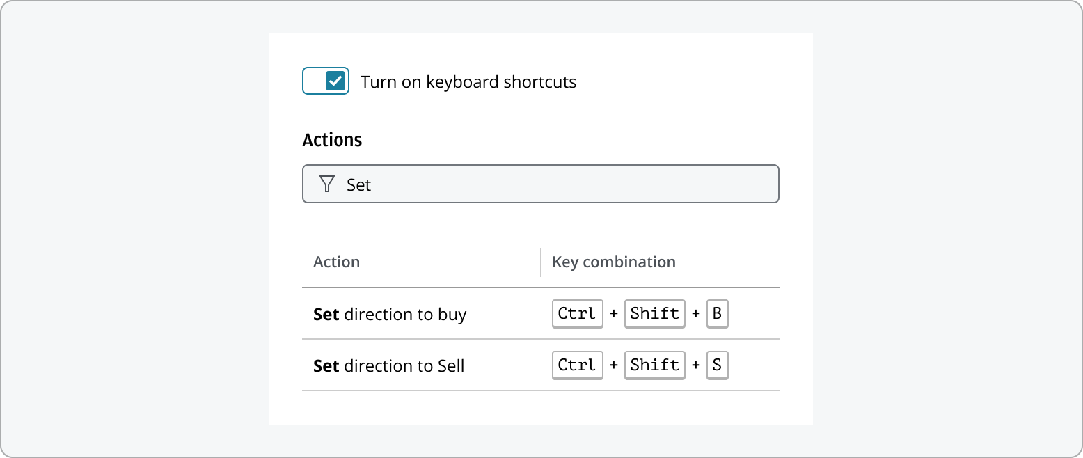
- Filter: This allows users to quickly search and locate specific shortcuts by typing keywords.
- Action name: Actions represent user-initiated commands—such as Save or Delete—that correspond to defined shortcuts. Each action should be clearly named to reflect the UI command executed by the shortcut.
- Description: For actions that are unique to your application or require additional context, a brief description can be provided to help users understand their purpose.
- Key: Each keyboard shortcut consists of two types of keys—modifier keys and character keys—which work together to trigger the action.
- Use Switch component to display keyboard shortcuts on/off switch.
- Use Combo box to display search field.
- Use Table to display keyboard shortcut list.

- The keyboard shortcuts initially displays all available shortcuts.

- When the user enters text in the filter input, the list updates to show only the matching shortcuts. For more details on filtering behavior, refer to the List Filtering pattern page.
Users can enable or disable keyboard shortcuts using the switch. When shortcuts are turned off, the shortcut list will be hidden from the pattern.

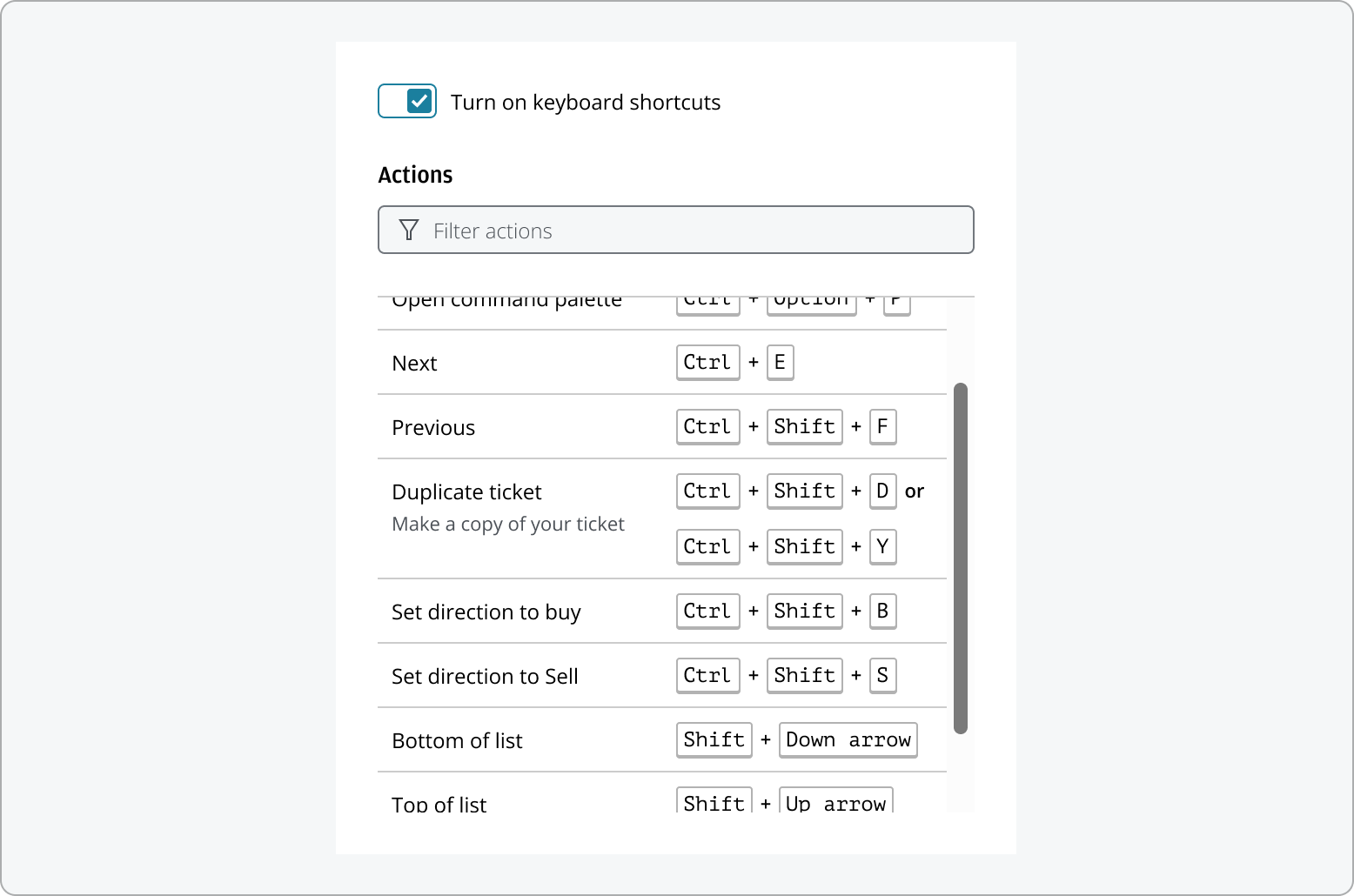
If the keyboard shortcuts list contains more items than can fit in the display area, a scrollbar will appear, allowing users to easily scroll through all available shortcuts.
To ensure accessibility for all users, any action to open or close the keyboard shortcuts—such as clicking a settings or close button—should also be operable through keyboard interaction. Providing both interactive elements and keyboard access ensures that all users can easily access and exit the keyboard shortcuts list, supporting a wide range of needs and preferences.
It is important to select a container for the keyboard shortcuts list that aligns with the product’s user experience and context of use. Common options include dialogs, drawers, or a preferences dialog. For example, a modal dialog is recommended when users need to focus on shortcuts without distraction. If the product includes many preferences options, keyboard shortcuts can be included as part of the preferences dialog. A drawer may be more suitable for persistent access. The choice of container should be guided by the context in which the keyboard shortcuts list will be accessed, ensuring the pattern effectively supports the intended task.
The following best practices are intended for application teams when setting up keyboard shortcuts within your product. We recommend considering both contextual and global shortcuts when setting up keyboard shortcuts for your application. Contextual shortcuts work only when specific elements are focused (for example, Ctrl + A selects text in an input field), while global shortcuts are available throughout the application (such as Ctrl + S to save). Assign shortcuts to components or the entire application as appropriate, and ensure the shortcuts list displays only those relevant to the user’s current context. This helps users discover and use shortcuts efficiently and avoids confusion or conflicts.
When defining your shortcuts, we recommend:
- Combine one modifier key with a character key that's associated with the name of the action (e.g., "Cmd + S" for Save).
- Use a maximum of three keys, at least one of which must be a modifier key.
- Testing your shortcuts on multiple keyboard layouts and operating systems to ensure they are easy to use, as keyboards vary between regions.
- Avoid ambiguous or hard-to-reach keys—prefer letters and numbers over symbols, as some characters (like the £ sign) are not universally available or may require complex key combinations on certain layouts.
- Account for differences across platforms, browsers, and keyboard layouts. Avoid using key combinations that may conflict with essential browser or system shortcuts.
- Clearly documenting shortcuts for each operating system.
When the user presses a modifier key at the same time as another key, the default function of that key is modified—and together they execute the assigned shortcut. Cmd, Ctrl, Shift and Alt are examples of keys that you can use to modify other keys.
Modifier keys available on common platforms:
| Platform | Modifiers | |||
|---|---|---|---|---|
| macOS | Ctrl | Shift | Option | Cmd |
| Windows | Ctrl | Shift | Alt | Win |
| Linux | Ctrl | Shift | Alt | Meta |
| Bloomberg | Ctrl | Shift | Alt | Go |
The modifier keys are automatically translated for users on Mac or Windows machines. For example, shortcuts using "Ctrl" on Windows will be mapped to "Cmd" on Mac, ensuring a consistent experience across platforms.
Bloomberg Keyboards
Bloomberg keyboards, common in financial environments, feature a distinctive orange Go key used to execute commands. When designing shortcuts for these keyboards, consider supporting the Go key and avoid conflicts with Bloomberg’s built-in shortcuts. Always test your shortcuts for compatibility.
You can display up to three character keys in a keyboard shortcut. Make sure at least one of the keys has a close association to the action that the shortcut executes—for example, "Cmd + S" for the Save action. This will make it easier for users to memorize keyboard shortcuts they'll use frequently.
The keyboard shortcuts typically use the following character keys:
- F1-F19, a-z, 0-9
- ', - , = , [ , ] , \ , ; , * , , . , /
- Left, Up, Right, Down, Pageup, Pagedown, End, Home
- Tab, Enter, Escape, Space, Backspace, Delete
- Pause/break, Caps lock, Insert
- Numpad0-Numpad9, Numpad_multiply, Numpad_add, Numpad_separator, Numpad_subtract, Numpad_decimal, Numpad_divide
If a keyboard shortcut you're considering is likely to conflict with an important pre-existing shortcut, manage the potential conflict by using:
- A different modifier key
- The second character key in the action's name
- An additional character key, but no more than three keys in total for usability
Please be aware that some hotkeys cannot be overridden, as doing so would interfere with a safe browsing experience for the user. These restrictions depend on the browser, and certain shortcuts are reserved to ensure user safety and a consistent browsing experience. When designing keyboard shortcuts, always verify that your chosen combination does not conflict with these reserved hotkeys.
In our examples, we use the react-key-hooks library to demonstrate keyboard shortcut implementation. It offers a simple and intuitive API for handling keyboard events, enabling you to add shortcut functionality with minimal setup. For installation instructions and detailed API usage, please refer to the official library documentation.
Providing keyboard functionality is essential for accessibility. Users with visual or mobility impairments may rely entirely on the keyboard, and many power users prefer keyboard shortcuts for efficiency. By implementing the keyboard shortcuts pattern, you enhance the user experience for everyone. It’s important to note that adding keyboard shortcuts alone does not guarantee full keyboard accessibility. All interactive elements in your application should remain accessible through standard keyboard navigation, such as using Tab, Shift+Tab, Enter, and Space keys to move focus and activate controls.
If your application includes shortcuts bound to a single character, you must comply with the Web Content Accessibility Guidelines (WCAG) 2.1. This means providing a way for users to toggle these shortcuts on or off, remap them to different keys, or ensure they are only active when the relevant element is focused.
If you need to expand the pattern or share feedback with us, please contact the team.